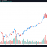
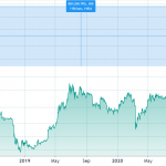
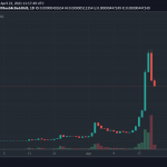
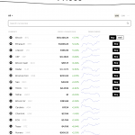
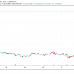
If you’re tired of staring at the BTC/USD chart, it’s time you switched up your graph game and turned your attention elsewhere. Bitcoin metrics can be measured in many ways; using fiat currency as a baseline reference is just one of them. Cast your gaze further afield and you’ll find an array of intriguing charts that will keep you captivated – for a few seconds at least.
Also: Litecoin Creator Charlie Lee Reveals He Sold All His Litecoin
Entering Uncharted Territory
Charting – predicting an asset’s future trajectory based on existing movement, signals, and volume – is an art. But even the most experienced of traders would struggle to apply Technical Analysis to the the ensuing graphs. Moving averages and bollinger bands are of little use once you enter the world of Lambo/BTC pricing. The following charts provide a fun way of reappraising the world’s favorite cryptocurrency.
WTF is the Bitcoin Price
Using the F-word isn’t big or clever, but it does command attention. Bitcoinprice.wtf is a site so simple a fourth grader could have coded it. Still, for a quick bitcoin price check with no F-ing around, it gets the job done.

Bitcoins Per Person
Take the price of bitcoin, divide it by the number of people in the world, convert the sum to USD and you get a current value of around $40. That’s how much BTC everyone would own if a large-scale wealth redistribution were to take place. This isn’t Communist Russia, so that’s not about to happen any time soon. Nevertheless, Bitcoins Per Person provides a useful indicator of the extent to which a digitally-savvy world could amass their own bitcoin savings.
Lambo/BTC
Lambo2btc.com does exactly what it sounds like, revealing the current ratio of BTC to the crypto community’s favored meme machine. Once one bitcoin achieves parity with one Lamborghini Aventador we’ll know we’ve all made it. Until then, keep trading sensibly and hodling hard.
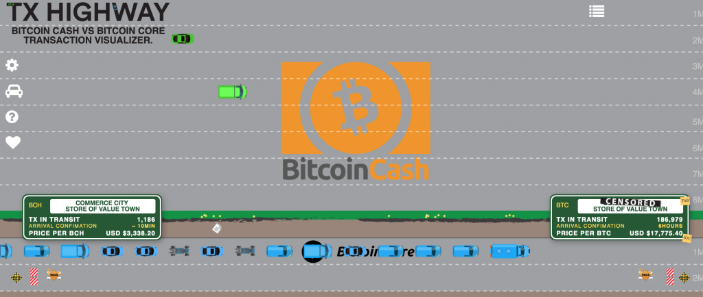
TX Highway
This last graph is also the best, visually at least. Having clearly been created by a bitcoin cash supporter, core fans would be advised not to click this link. TX Highway provides a highly entertaining representation of the speed at which the BCH network zips by compared to that of its congested fraternal fork. Kudos for the depiction of the Lightning Network as a railway still under construction with the advice to “Check back in 18 months…maybe”. If the foregoing graphs are amusing, this one is mesmerizing. Who knew that watching little green cars could be so soothing?
What alternative bitcoin charts and representations do you recommend? Let us know in the comments section below.
Images courtesy of Shutterstock.
Need to calculate your bitcoin holdings? Check our tools section.
The post Unusual Bitcoin Charts to Feast Your Eyes On appeared first on Bitcoin News.


